Build any report
you can imagine
Design dashboards with drag and drop cards. Pick a source, metrics, group, filter, and chart. Export to PDF or Excel.
From raw data to executive dashboards in 4 steps
Connect any source, choose a metric, slice it your way, and turn it into a chart anyone can read. Export to PDF or Excel.
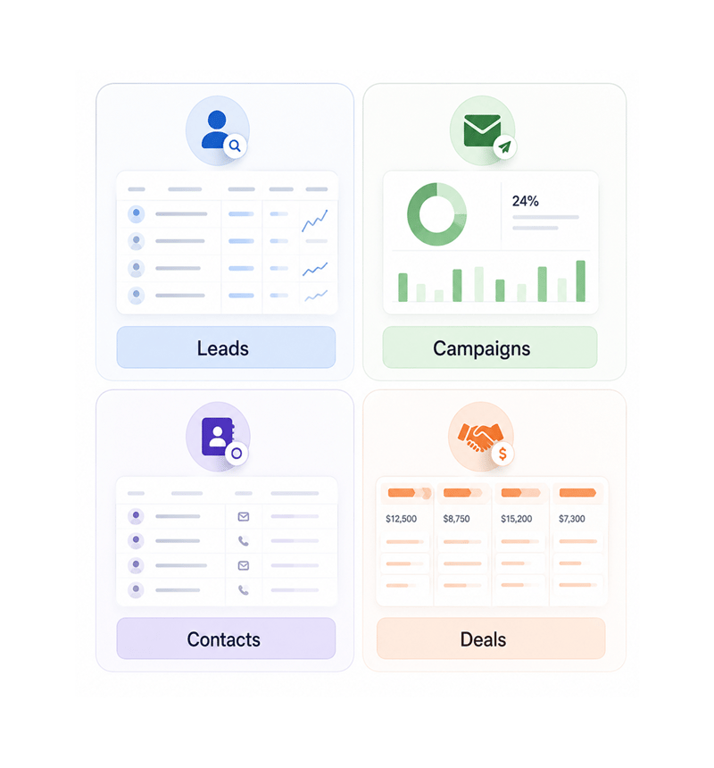
Data Source
Pull from leads, campaigns, contacts, or deals
Every report starts with a question, and every question starts with the right dataset. Pick the source that answers it: your leads, an email campaign, contacts, or the deal pipeline. The same builder works everywhere.
- Leads
- Campaigns
- Contacts
- Deals
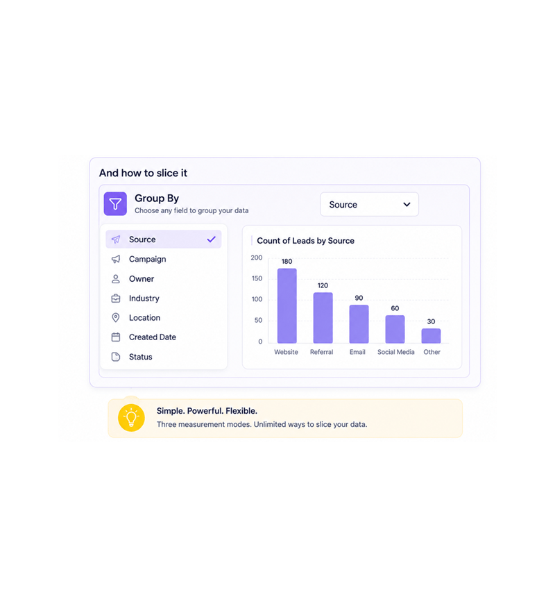
Metrics & Grouping
Pick what to measure and how to slice it
Choose your metric, then group by any field. Count records, sum a numeric field, or average a value. Group leads by source, deals by stage. Three measurement modes cover most business questions, no formula language.
- Count
- Sum
- Average
- Group By
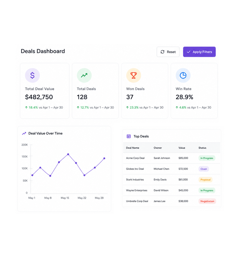
Filter & Chart
Add filters and pick the right chart
Narrow the report with as many filters as you need: date range, status, owner, tag, lead score, deal value. Then visualise it as bar, line, or pie charts, tables, or single value cards. Every change updates instantly.
- Filters
- Bar
- Line
- Pie
- Table
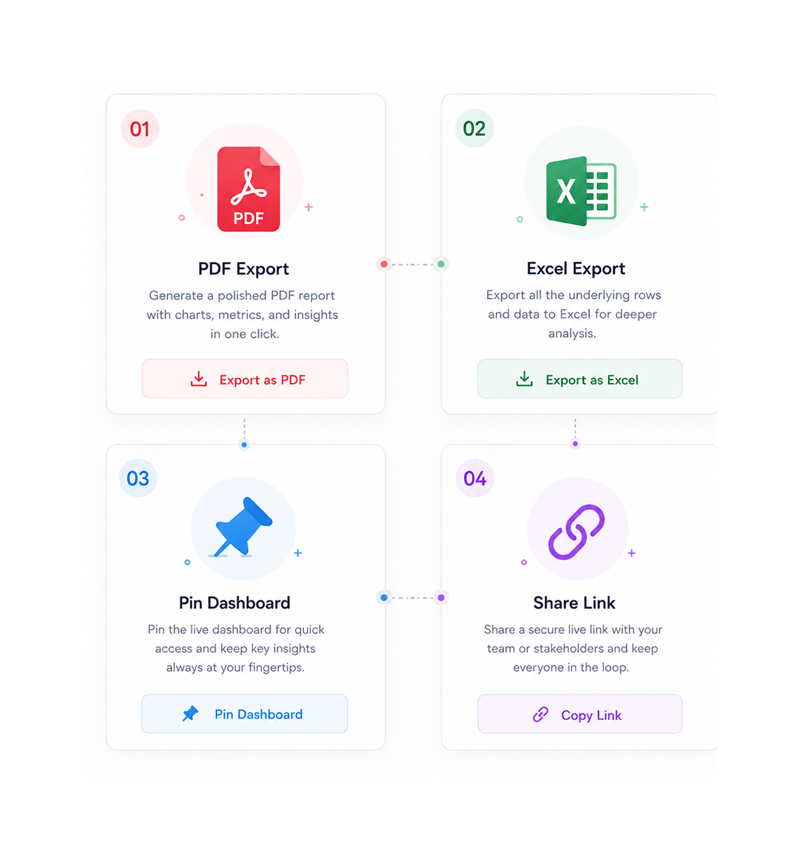
Export & Share
Export to PDF or Excel in one click
Every report is share ready the moment it loads. Send a polished PDF to leadership for the weekly review, drop the rows into Excel for finance, or pin the live dashboard. No more rebuilding the same view every Monday.
- PDF Export
- Excel Export
- Pin Dashboard
- Share Link
Six reasons teams never go back
Once a team builds its own reports without a ticket to the data team, static dashboards feel like working in the dark.

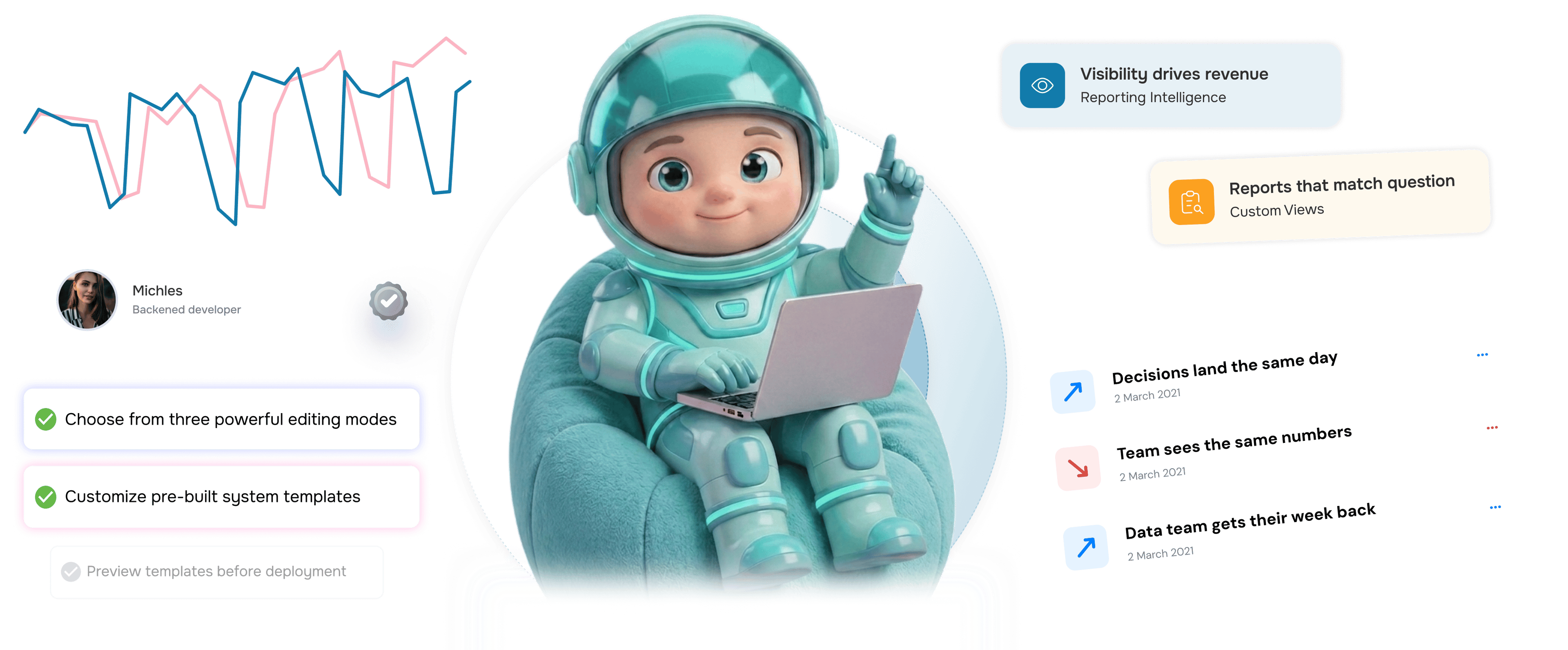
Decisions land the same day, not the same quarter
Marketing teams stop waiting on the data team for a custom view of campaign performance. Build, read, decide. Question to answer drops from days to minutes.

Everyone on the team sees the same numbers
Sales ops teams replace conflicting screenshots with shared live dashboards. When everyone opens the same view, meetings stop being about whose number is right.

Reporting becomes a five minute habit
Customer success teams build the report they need in the time it took to find the spreadsheet. The drag and drop builder makes reporting a normal part of the day.

Executives get answers in their inbox
Operations leaders stop screenshotting dashboards at midnight for the founder. Export to PDF, attach, send. Six hours of compiling now takes one click.

Email campaign performance is no longer a mystery
Email marketing teams finally know which campaigns drive pipeline, not just opens. Campaign metrics tie directly to lead status, deal stage, and revenue.

The data team gets their week back
Analysts stop being a custom report factory and return to strategic work. The business builds its own views, the data team handles questions that need them.
Decisions land the same day, not the same quarter
Marketing teams stop waiting on the data team for a custom view of campaign performance. Build, read, decide. Question to answer drops from days to minutes.
Everyone on the team sees the same numbers
Sales ops teams replace conflicting screenshots with shared live dashboards. When everyone opens the same view, meetings stop being about whose number is right.
Reporting becomes a five minute habit
Customer success teams build the report they need in the time it took to find the spreadsheet. The drag and drop builder makes reporting a normal part of the day.
Executives get answers in their inbox
Operations leaders stop screenshotting dashboards at midnight for the founder. Export to PDF, attach, send. Six hours of compiling now takes one click.
Email campaign performance is no longer a mystery
Email marketing teams finally know which campaigns drive pipeline, not just opens. Campaign metrics tie directly to lead status, deal stage, and revenue.
The data team gets their week back
Analysts stop being a custom report factory and return to strategic work. The business builds its own views, the data team handles questions that need them.


3400+
Reporting teams shipping faster
Built for teams that turn data into decisions
Marketing leaders, sales ops, CS managers, and finance teams use EVOX reports as the source of truth. The canvas is the builder, the data sources are the raw material, the chart is the story, the export button is the delivery.
Drop Builder
Pre Built Cards
Custom Reports
+ Excel Export
Visibility drives revenue
Email marketing teams use dashboards to track every lead, campaign, and deal in one place. The result is a sharper team, smarter campaigns, and a pipeline everyone can defend.
Everything the reporting dashboard ships with
A complete reporting toolkit inside your email platform. A drag and drop canvas, ready made cards, and one click exports.

Custom Report Builder
Compose a report in four moves. Pick a source: leads, campaigns, contacts, or deals. Choose count, sum, or average. Set the group by field. Add filters.

Drag and Drop Widget Cards
Build dashboards on a visual canvas with no developer. Resize, rearrange, and remove widget cards in real time. Your layout, live data, like sketching.

Nine Pre Built Dashboards
Out of the box cards for leads, contacts, deals, email queue, SMTP health, and campaigns. Pin the ones you check daily.

SMTP Health Monitoring
A dedicated dashboard for sending infrastructure. Track delivery rates, bounce trends, queue size, and provider performance across SMTP, Gmail, and SES.

Multiple Chart Types
Bar, line, pie, table, and single value KPI cards. Choose the visualisation that lands clearest without rebuilding the report. The switcher is one click.

Export to PDF and Excel
Every report exports cleanly to two formats. Send a polished PDF to leadership, or drop the raw rows into Excel for finance. Same report, zero rebuild.
Everything you need to know
Common questions about the EVOX reports dashboard and what you can do with your data.
Evox sends campaigns that feel one-to-one at scale.
Behavior-triggered emails that build, personalize, and send themselves so every subscriber gets the right message at the right moment.
- 4.1x
- average campaign ROI
- 68%
- open rate improvement
- 3.2x
- conversion rate lift
- 0
- spam complaints