Know how your workflows actually perform

Total executions, success and failure rates, average execution time per workflow, the most used workflows in the workspace, error trends over time, and date range filtered charts across every metric. Identify the bottlenecks and optimise them before they become incidents. A workflow automation platform where every metric your team needs to run automation at scale is one click away, always fresh, and always actionable.

Know
How It Works

From idea to shipped integration in 4 steps

Register your application in the Developer Console and get a clean workspace for your integration. Define the triggers and actions you want to expose with JSON schema declarations. Configure the secure authentication flow that connects your users to your service. Publish to the Revo app marketplace and every Revo customer can find and install your integration in one click.

1
2
3
4

At a Glance

See every metric at a glance

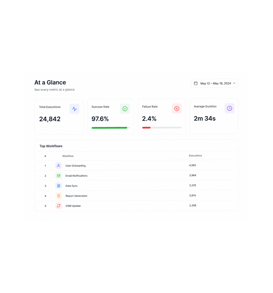
The dashboard opens with the metrics every team running automation at scale needs to see first total executions in the window, the success and failure rate breakdown, the average execution time per workflow, and a ranked list of the most used workflows in the workspace. The numbers refresh as new runs complete, so the team always has the freshest picture of how every automation is performing right now.

Total ExecutionsSuccess RateAverage DurationTop Workflows

Trend Charts

Spot the trends before they become incidents

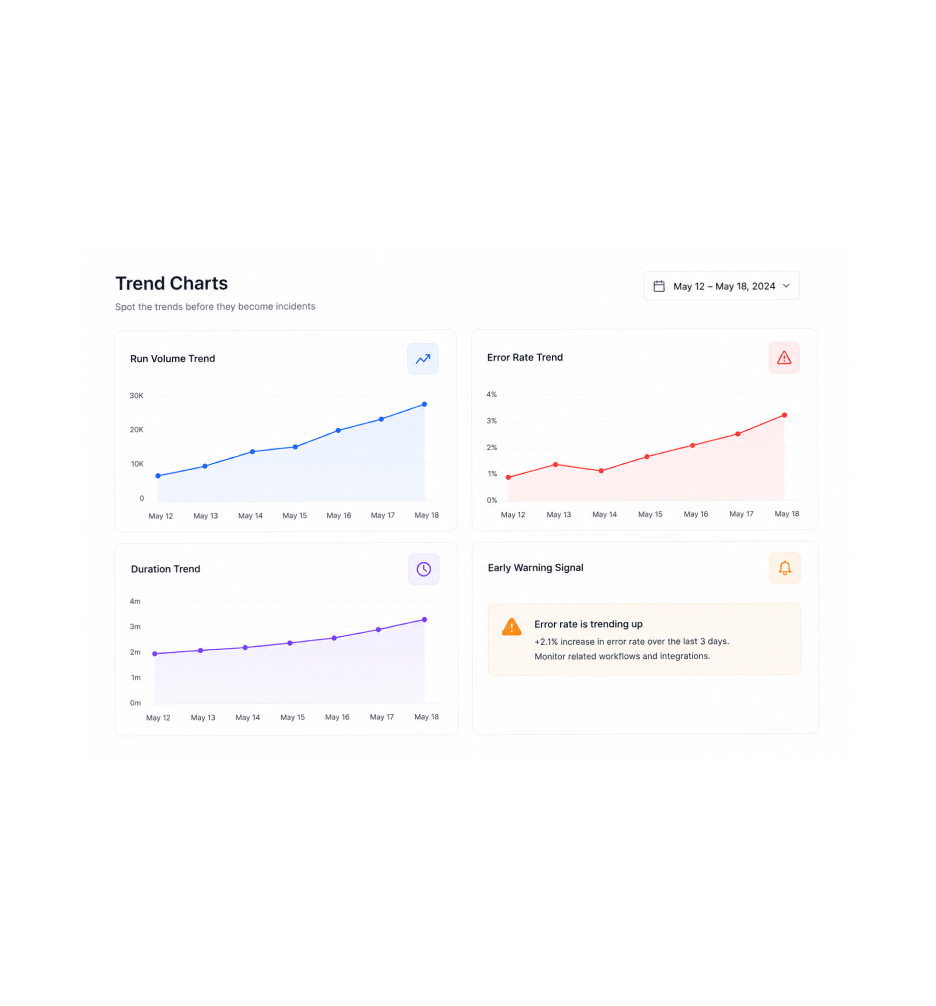
Trend charts show how every metric moves over time run volume rising as your business grows, error rates ticking up before a third party service finally breaks, average duration creeping higher as a workflow accumulates extra steps. The patterns that used to surface only after a customer complained show up first in the trend chart, which means the team gets to fix them before they become an incident anyone outside the workspace notices.

Run Volume TrendError Rate TrendDuration TrendEarly Warning Signal

Date & Workflow Filters

Filter every metric by date and workflow

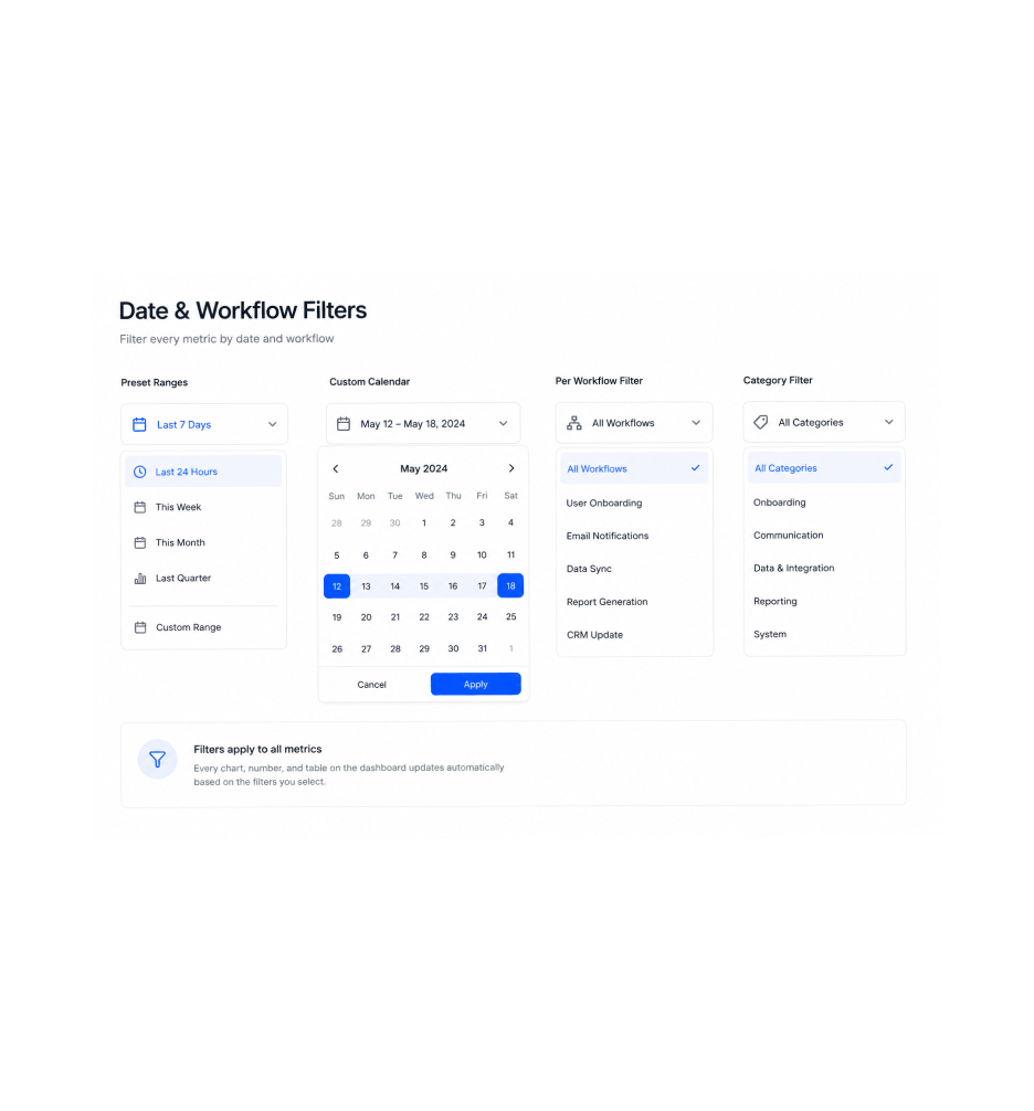
Slice the view down to exactly the slice that matters with date range filters and workflow filters that apply across every chart on the dashboard. Last twenty four hours, this week, this month, last quarter, or a custom range you pick on the calendar pick once and every metric updates to match. Add a workflow filter to focus on a specific automation, or pick a category to see the metrics across a whole class of related workflows.

Preset RangesCustom CalendarPer Workflow FilterCategory Filter

Drill Into Runs

Drill into the runs behind the numbers

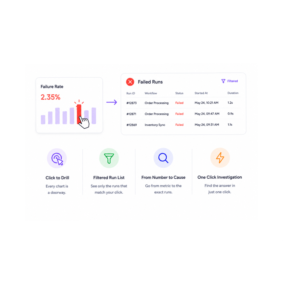
Every chart is a doorway. Click the failure rate bar and the execution history opens filtered to the failed runs in that window. Click the slow workflow and the runs that took the longest appear in order. Click the trend spike and the exact set of runs that caused the spike is one click away. The dashboard does not just show you what happened it takes you to where the answer lives.

Click to DrillFiltered Run ListFrom Number to CauseOne Click Investigation
Why Teams Choose REVO

Six reasons teams never go back

Once a team has a single dashboard showing every key metric across every workflow with trends, filters, and drill downs ready when the team has the question the old pattern of running reports out of three different systems and stitching the picture together by hand starts looking like work nobody should be doing. These are the changes that show up first.

Volume, success, and speed in one view

Volume, success, and speed in one view

Total executions, success and failure rates, and average execution time all share the same dashboard, the same date range, and the same set of filters. The picture of how every automation is performing right now is one screen instead of three reports, which means the morning operations review takes minutes instead of half an hour and the team actually does it instead of skipping it.

Trends surface problems before incidents

Trends surface problems before incidents

The error rate that has been quietly creeping up for three days shows up in the trend chart long before it becomes an incident anyone outside the workspace notices. The duration that has been growing every week as a workflow accumulates extra steps appears in the duration trend before it slows the team down. The early warning signals every operations team wishes they had finally exist in one place, ready to consult before things go wrong.

The slow workflows have nowhere to hide

The slow workflows have nowhere to hide

Average execution time per workflow ranks every automation by how long it takes, so the workflow that has quietly grown to take three minutes when it used to take twenty seconds becomes immediately visible. The bottleneck nobody noticed because nobody was looking gets surfaced as a number the team can actually act on, which makes optimisation a targeted exercise instead of a fishing expedition.

The most used workflows get the attention they deserve

The most used workflows get the attention they deserve

The most used workflows ranking shows which automations are doing the heaviest lifting in the workspace, which makes the prioritisation question much easier to answer. A one second optimisation on the workflow that runs ten thousand times a day saves more total time than a fifty percent speed up on the workflow that runs twice a week. Knowing which workflows matter most is the first step to spending engineering time well.

Error patterns become obvious

Error patterns become obvious

The error trend chart shows when errors are happening, which workflows they are concentrated in, and which kinds of errors are recurring. The Tuesday morning spike in a specific error type that used to be invisible to anyone not looking at the run logs at the right moment becomes a visible pattern with a clear shape, which makes diagnosing the root cause a focused exercise instead of a hunt across a sea of individual incidents.

Date range filters slice every metric

Date range filters slice every metric

Pick a date range once and every metric on the dashboard slices to that window total executions, success rates, average durations, top workflows, trend charts, error charts. Comparing the last seven days to the previous seven days, or this month to last month, becomes a matter of changing the range rather than running three separate reports and copying numbers into a spreadsheet by hand.

Stop waiting for incidents.
Start seeing the patterns first.

Total executions, success and failure rates, average duration per workflow, most used workflows, error trends, and date range filtered charts all in one dashboard with one click drill down to the runs behind every number.

Who uses REVO analytics
Deepak MehrotraDeepak MehrotraDeepak MehrotraDeepak Mehrotra

13400+

Teams optimising automation
with the analytics dashboard

Built for teams who optimise what they measure

Operations leaders running automation at scale, platform teams responsible for the health of the workspace, automation engineers tuning workflows for performance, customer success managers answering how is the automation behaving for our customers questions, finance specialists tracking the execution patterns behind business critical processes, and founders watching the operational health of the company all use the Revo Analytics Dashboard as the single source of truth for how every automation is performing. Every team a small business tracking a handful of workflows or a larger organisation orchestrating hundreds of business process automations gets the same metrics, the same trends, the same filters, and the same drill downs in one place.

Live

Metrics

Trend

Charts

Date

Filters

Workflow

Insights

Performance Overview

Totals, rates, durations, rankings

The dashboard opens with every metric the team needs at a glance total executions in the window, success and failure rate breakdown, average execution time per workflow, and a ranked list of the most used workflows in the workspace. The numbers stay fresh as runs complete, so the team always works from the latest picture.

Totals, rates, durations, rankings
Features

Everything the analytics dashboard ships with

A complete analytics toolkit built into the same workflow automation platform your team already uses. Total execution counts, success and failure rate breakdown, average duration per workflow, most used workflow rankings, error trends over time, and date range filtered charts come together so the team always knows what is performing, what is slowing down, and what needs attention next.

Total Executions and Run Volume

Total Executions and Run Volume

The total execution count for the selected window, with a breakdown by workflow, by trigger type, and by status. See exactly how much automation work the platform is doing for your team across any time horizon. The number that everyone always wants to know first is the number that appears first.

Success and Failure Rate Breakdown

Success and Failure Rate Breakdown

The overall success rate of every workflow in the workspace, broken down by workflow, by error category, and by trigger source. The single number that captures the health of automation across the team sits alongside the breakdown that explains it, so the next question after how are we doing is already answerable in the same view.

Average Execution Time Per Workflow

Average Execution Time Per Workflow

Every workflow shows its average execution duration across the selected window, with the workflows ranked from slowest to fastest. The workflow that has quietly grown to take three minutes when it used to take twenty seconds appears at the top of the slow list, which makes the bottleneck visible without anyone having to go looking for it.

Most Used Workflows Ranking

Most Used Workflows Ranking

The most used workflows in the workspace ranked by execution count, with their success rate and average duration alongside each entry. The automations doing the heaviest lifting in the business become visible at a glance, which makes prioritising optimisation work an obvious exercise rather than a debate.

Error Trends Over Time

Error Trends Over Time

The error rate over time as a trend chart, with a breakdown by error category and by workflow. The Tuesday morning spike in a specific error type that used to be invisible becomes a visible pattern with a clear shape, which makes diagnosing the root cause a focused exercise instead of a hunt across individual incidents.

Date Range Filtered Charts

Date Range Filtered Charts

Every chart on the dashboard respects the date range filter. Last twenty four hours, this week, this month, last quarter, or a custom range from the calendar pick once and every metric updates together. Comparing this week to last week becomes a matter of changing the range rather than running three separate reports.

Total Executions and Run Volume

Total Executions and Run Volume

The total execution count for the selected window, with a breakdown by workflow, by trigger type, and by status. See exactly how much automation work the platform is doing for your team across any time horizon. The number that everyone always wants to know first is the number that appears first.

Success and Failure Rate Breakdown

Success and Failure Rate Breakdown

The overall success rate of every workflow in the workspace, broken down by workflow, by error category, and by trigger source. The single number that captures the health of automation across the team sits alongside the breakdown that explains it, so the next question after how are we doing is already answerable in the same view.

Average Execution Time Per Workflow

Average Execution Time Per Workflow

Every workflow shows its average execution duration across the selected window, with the workflows ranked from slowest to fastest. The workflow that has quietly grown to take three minutes when it used to take twenty seconds appears at the top of the slow list, which makes the bottleneck visible without anyone having to go looking for it.

Most Used Workflows Ranking

Most Used Workflows Ranking

The most used workflows in the workspace ranked by execution count, with their success rate and average duration alongside each entry. The automations doing the heaviest lifting in the business become visible at a glance, which makes prioritising optimisation work an obvious exercise rather than a debate.

Error Trends Over Time

Error Trends Over Time

The error rate over time as a trend chart, with a breakdown by error category and by workflow. The Tuesday morning spike in a specific error type that used to be invisible becomes a visible pattern with a clear shape, which makes diagnosing the root cause a focused exercise instead of a hunt across individual incidents.

Date Range Filtered Charts

Date Range Filtered Charts

Every chart on the dashboard respects the date range filter. Last twenty four hours, this week, this month, last quarter, or a custom range from the calendar pick once and every metric updates together. Comparing this week to last week becomes a matter of changing the range rather than running three separate reports.

Questions & Answers

Everything you need to know

Common questions about what the default dashboard shows, how the trend charts are calculated, exactly what counts as a success versus a failure, what date range options are available, how the drill down from a chart to the actual runs works, and how dashboards can be exported or shared with people outside the workspace.

The default dashboard opens with every key metric a team running automation at scale needs to see first total executions in the selected window, the success and failure rate breakdown, the average execution duration ranked by workflow, the most used workflows in the workspace, the error trend over time, and the run volume trend. Every metric refreshes as new runs complete, so the team always works from the freshest picture without manually refreshing anything.

Network background
REVO · Analytics Dashboard

Stop guessing what your workflows do.
Start measuring what they do.

Total executions. Success and failure rates. Average duration per workflow. Most used workflow rankings. Error trends. Date range filters. One click drill down. The analytics layer your automation has always deserved.